I am not an artist, nor have I ever claimed to be, I am an engineer and I think like an engineer, but like everyone I can appreciate a good color scheme and like everyone who has ever created a website I've gone through the struggle of figuring out a decent color palette. After a while of struggling with mine I finally realized that the simple way of doing it (which is also the way I recommend) is to simply copy someone else. Some of you may recognize that I've copied the Gruvbox color scheme here and there are plenty of other great color schemes free for the copying.
But with my interest in computer generated art I've wondered how to craft color schemes, or rather how I could teach a computer to generate one. So I went and researched a bit of color theory to find a mathematical approach to this problem. Keeping in mind Galileo's quote, "Measure what is measurable, and make measurable what is not so," I was sure that there was some good way to measure color and some way to manipulate those measurements to craft pleasing color schemes out of any color.
There are actually several ways to measure color, RGB is probably the most common because it is how most image files store the data of each individual color and it is quite convenient for computers since that is the format most similar to how computer monitors actually display images (and some say that that is how our eyes pick up color as well, I haven't put enough research into that claim though) but it is hard for us to manipulate easily. Hexadecimal colors are also quite nice for computers since it is really just a different format for RGB that is even harder for us humans to manipulate.
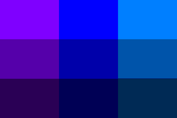
I found that when it comes to mathematically manipulating color to find colors that work well together, HSV is the best form of measurement (HSL is also incredibly similar to HSV and is just as useful). The H stands for the hue, S for saturation, and V for lightness value (or something like that). When we are looking to find colors that work well with each other the hue is our main concern, and in this format it is very workable, imagine a color wheel, with a standard HSV or HSL format H is a value between 0 and 360 which represents the degree on the color wheel where that particular hue appears (red being at 0, green at 120, and blue at 240). When we know the position where a hue lies on a color wheel we can easily do some calculations with that to find other colors that work well with that particular color.
I first came across the following concepts in a user interface textbook and I looked further into these as I researched how to manipulate color. I found that all of these things are things that artists talk about, and while artists aren't known to be fans of math the following color combinations are completely based in math and artists are completely oblivious to it, everything I read that was written by an artist didn't mention the math at all (and as a result their explanations were incredibly vague) while everything I read written by an engineer or scientist had understandable explanations based in simple math. If any artists are reading this I suggest you spend some time learning the math that will help you in your field.

A monochrome color palette is the easiest to explain, it is simply a palette that consists of multiple tints and shades of a single hue. In the HSV format the only parts that need be manipulated are the saturation and light values. (Note that in the above example, along with all the other ones I will show here, I only changed the light values and left everything at full saturation).
Analagous color palettes consist of colors of similar hues, the simple way of creating analagous color palettes is to take one hue as a base then move 30 degrees in either direction, those three hues will then be what you use as you can be free as always to manipulate the saturation and light.
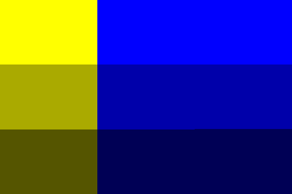
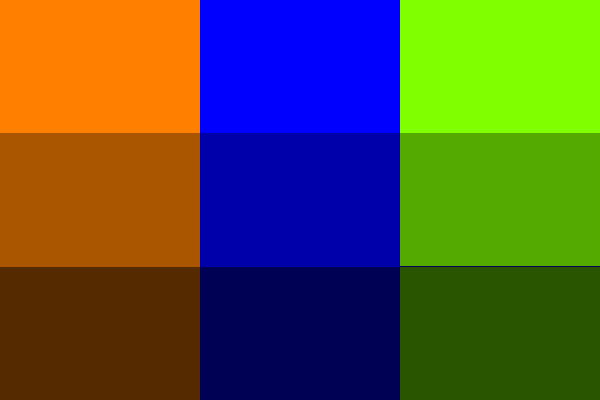
Complimentary colors are colors which lie opposite each other on the color wheel, meaning that you just need to go 180 degrees around the wheel from the hue that you started with to get your compliment hue. It is important to note that the color wheel we are working with here is not the same as the color wheel you may have learned about in grade school, it is based off of red, green, and blue, rather than red, yellow, and blue. This is why (as we see above) yellow is considered the opposite of blue here rather than orange.
With a complimentary color palette it is best to have one of the two hues be dominant by taking up around 80% of the content.
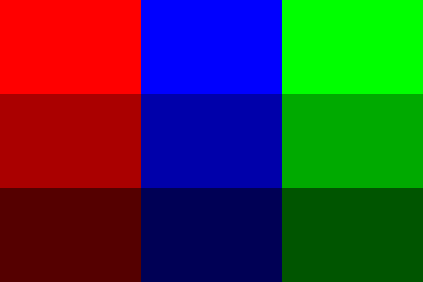
A triadic color palette consists of hues which all lie an equal 120 degrees from each other, splitting the color wheel into thirds. Artists will explain this concept by saying it's like drawing a triangle on the color wheel, this is a terribly imprecise way of explaining this process.
Tetradic color palettes are conceptually similar to triadic ones, only here the hues are separated by 90 degrees splitting the wheel into fourths. Again, artists would say this is like drawing a square on the color wheel which again is a terrible explanation.
Of these examples I find split complimentary palettes the most interesting. To get one of these palettes take your base hue and go 150 degrees around the wheel in either direction. This will give you two hues that are 30 degrees off from the hue that is complimentary to your starting hue.
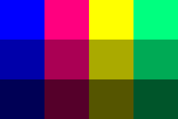
Now of course we would rarely want to limit ourselves to only a three or four hues, often times we need more options than that, especially when doing something like designing a website. Luckily you can combine concepts from these six styles of color palettes to make a palette that is large enough for your needs without spending hours of trial and error trying to find more colors that fit just right. And like any good programmer I wrote a program that does this automatically. Here are some examples of results from my program:


All of the S and V values of these colors are completely random, but the hues are based off of each other. The second and third hues are the split compliments of the first, the fourth and fifth hues are analagous to the second one and the sixth hue is analagous to the first, then the last hue is the same as the third but the saturation and lightness are different. It's all math, not wizardry, and I'm sure there exists a multitude of similar applications of this that will make similarly coherent color palettes, the above examples are of course ones that were among my favorite but every palette that my program has output is a combination of colors that work well together. (It is important to note that I didn't come up with this particular way to combine the different types of palettes, I copied it from here I just did it with python and random colors rather than photoshop and hand-picked ones)
The code that I used to randomly generate the above palettes along with the code for the examples above can be found here feel free to play around with it or just see what other palettes it spits out.
Computers are going to replace people in a lot of fields, don't become obsolete.