So I used to watch a lot of documentaries, but good documentaries that I'm actually interested in and have the paitence to watch are hard to come by these days, but conference talks on the other hand are pleniful, and every once in a while I stumble across one that I find really thought proviking. This was the case with Maciej Ceglowski's The Website Obesity Crisis from some web developer conference that took place in Australia back in 2015. I'd like to discuss a bit of my thoughts on it here.
A website (or anything really) is bloated when it contains more stuf than it needs to, in the computing world the ammount of stuff is measured in bytes, but since a single byte typically can't hold much (one letter in a standard text file) we are more used to seeing measurements as kilo- mega- or even gigabytes. Back in the day authors of websites strived to keep thier pages as small as possible becasue internet speeds were incredibly slow, but now that the internet is faster web designers no longer worry about the size of their pages. If we can use the internet to reliably stream 4k video then we should be able to put any ammount of data up right? Well you could, but just becasue we can doesn't mean we should.
Ceglowski suggested that text based web pages should try to take up as much bandwidth as a piece of classic Russian literature would. Now you might think, "A piece of classic Russian literature? Really? War and Peace is one of the fattest books on my shelf. There is no way that that six paragraph Buzfeed article on celebrities that are taller than you'd think could take up that much space." To that sort of remark I'd explain that there are many ways that a seemingly substanceless webpage can take up so much data. One of these ways is through careless use of pictures, and becasue Ceglowski pointed out the ironic fact that articles that point out the uneccecarily large sizes of some web pages seem to always be much larger than the avreage webpage, I'll be including a lot of them, mostly slides from Ceglowski's presentation. Keep in mind that the smallest of these pictures takes up more data than every other thing I've written on this site combined.
Websites should really only have a little bit more stuff in then than the main content they exist for. Ceglowski suggests this pyramid as a template for what should be in a site:
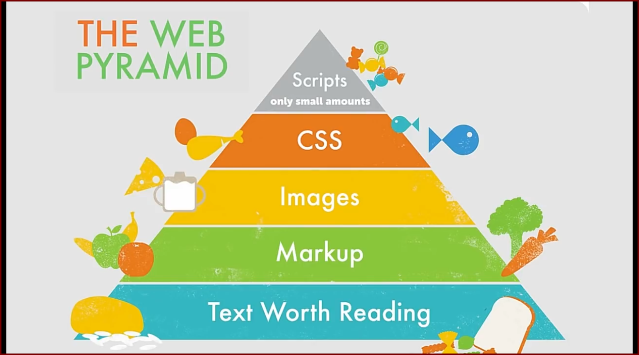
According to this diet, my site is almost starving since I typically don't include much more than the text you're reading alon with basic markup and a basic CSS stylesheet. I can't think of a site which fits this mold perfectly, but my site is a lot closer to this ideal than most other sites you'll visit, because, according to Ceglowski, this is what the typical website actually looks like:

Nearly the entirety of Ceglowski's suggested structure fits within the HTML portion of the above diagram, and we all should be familiar with the surveillance sectoin, so what's in the rest of it?
I've already touched on how pictues can take up a lot of space, but as long as the pictures serve some sort of purpose in relation to the main content of the page and they don't take up too much data, they are excuseable. But what is rarely excuseable in text based web pages are videos. I hate it when I click on an interesting headline on a news site and am then directed to a breif article acompained with a two minute clip of their morning show, I'm unlikely to watch the clip so why must it take up my bandwidth? But an argument can be made for this type of situation, but there is no argument for pages that have some sort o video playing for no reason.
I'm sure we've all visited a site which had a big high definition spinning globe or something at the top of it, we probably even glanced at it for half a second and something in our brain may have even said, "Hey, that's cool," but a second later we scroll down to read whatever we were looking for, we didn't go to that site to stare at the background, we went there to consume the actual content that the site has to offer. Why should the background of a site take up exponentially more data than the stuff we went to the site to see. If the web page was put together exeptionally poorly then there is a chance that the background of the page is causing your browser to perpetually re-download the same six second clip over and over again. Ceglowski suggested that if a website looks good with pictures of President William Howard Taft rather than whatever other pictures or videos designers would want there then they should just include pictures of Taft instead.
I don't believe in tablets, I don't use them like other people do, so I'm not going to spend too much time talking about them, but tablets are great for some people. When iPads hit the market web pages started to evolve, once simple and unimportant buttons were enlarged and styleized, and of course the fanciest ones are the ones you press least often. I'm glad that I'm not a web designer because designing sites to work well on all sorts of hardware is not fun.
Up until this point I've only mentioned things which lie wihin the developer's controll, but once a page lets ads on it, then there is no way for a developer to know if the page they just spent hours designing and optimizing will still look good and perform well. A rather standard 3 MB page could be loaded up with an obsene 50 MB advertizement.
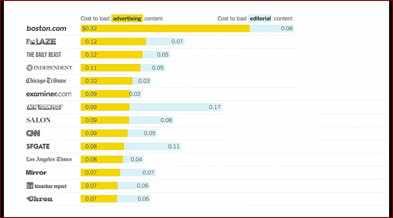
In his presentation Ceglowski pulled up this graph which shows (based off of 2015 US average cost per byte of internet bandwith) a comparison of how much money it costs for a user to pull up the ads in various sites vs. the actual content of those sites. We can see that ads don't only cost us our time and safety from computer viruses, but the mere act of displaying ads cost us money in the form of internet bandwidth. (There's another good argument for using an ad blocker) (Of course this sort of graph only applies to primaily text based sites, if this graph had included YouTube then that entry would have had a much more reasonable ad to content ratio)
I could complain for days about ads, but I'm sure we all could so I won't bore you with it more.
At the end of his presentation Ceglowski showed two video game screenshots.

Minecraft is a relatively basic game, it isn't a very pretty game, but it is a platform for endless creativity.
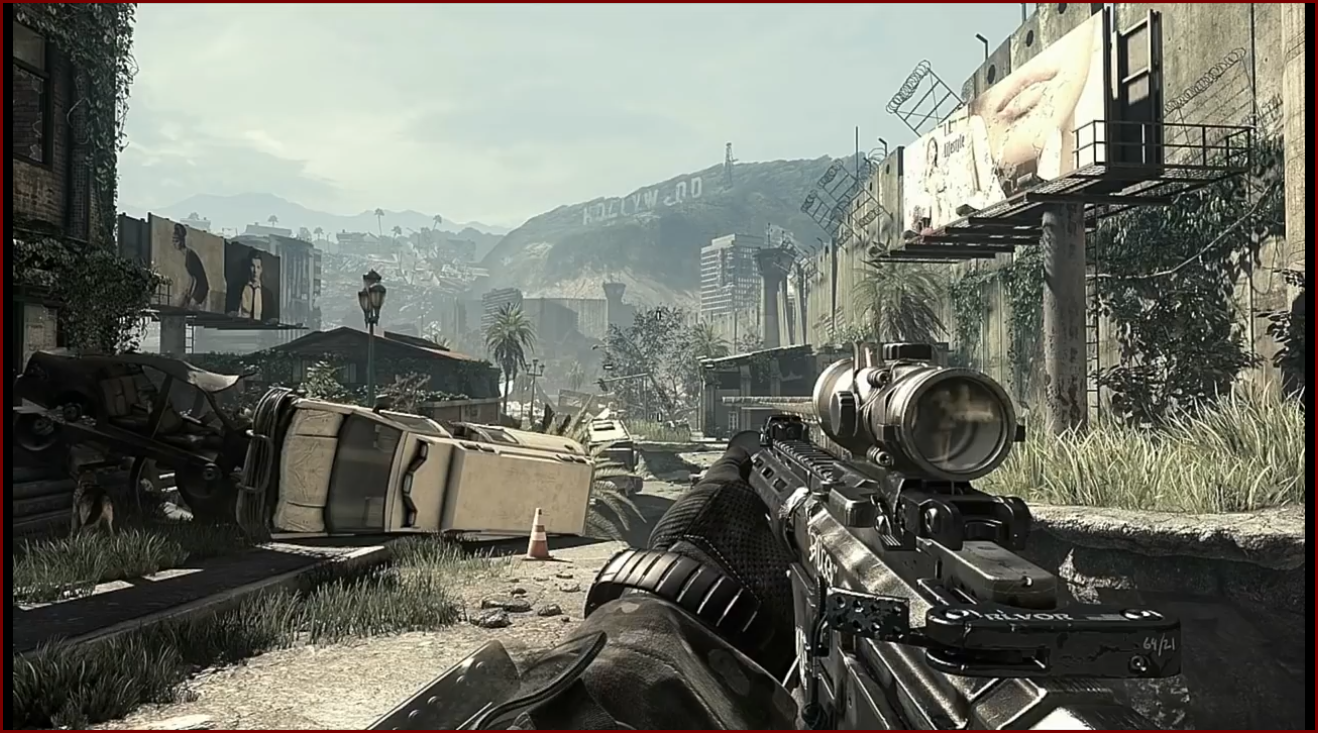
Call of Duty games are always being diveloped to have the best graphics and increasingly compelling gameplay, but they take much more resources to run and at the end of the day they don't do much to stand out from the other games in their genre.
We want the internet to be more like Minecraft. We want to see cool and unique things done with less, rather than the same sort of stuff we are already used to done with more.
I realize that I nor anyone likely to read this will have much of an impact on the future of the internet, we will all probably continue to be forced to use bloated sites, but we should be looking to remove bloat from other parts of our lives. Is a built in backup camera really worth paying an extra $500 for a new car? No, you're safer atually turning around to back up anyways. Is it really worth spending an extra $1.25 to have a scoop of guacamole on your burrito? No, you could buy a whole avacado for less than that. Is TV really worth your time? No, you could be doing more productive things with your life.
Optimize your life for maximum utility and joy.